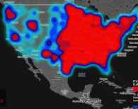
Mapping hate across U.S.Data visualization company Floating Sheep has produced a fascinating map of the mainland U.S. which charts the use of hate speech on twitter. The so-called “hate map” shows the frequency of geotagged tweets containing certain certain racist, homophobic and ableist terms, the end result being an interactive map highlighting hate hot spots across the country.