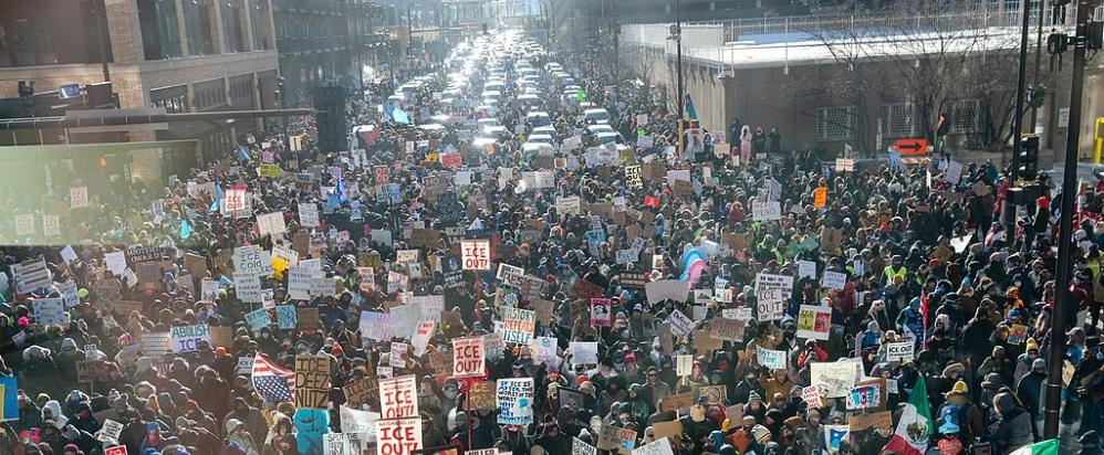

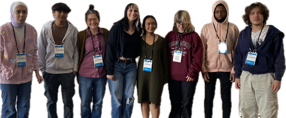

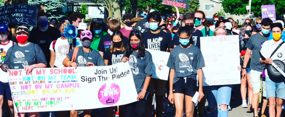

Not In Our Town is a movement to stop hate, racism and bullying, and build safe, inclusive communities for all.
PREVIEW OUR NEW FILM
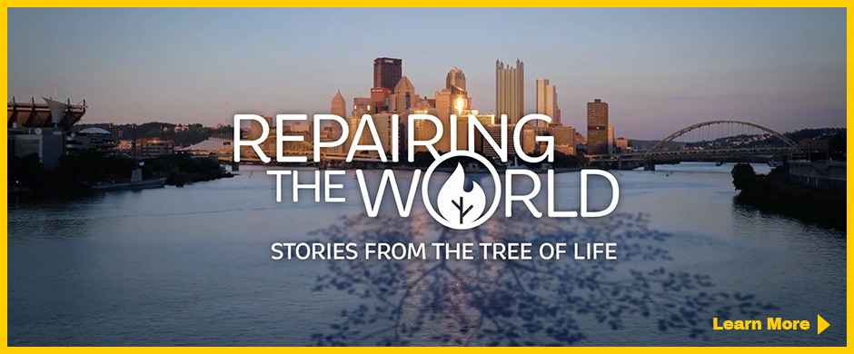
Repairing the World: Stories from the Tree of Life
A new feature documentary and community engagement project from Not In Our Town about Pittsburgh's powerful response to hate and antisemitism. Watch the trailer, find resources, and get involved at repairingtheworldfilm.org →